
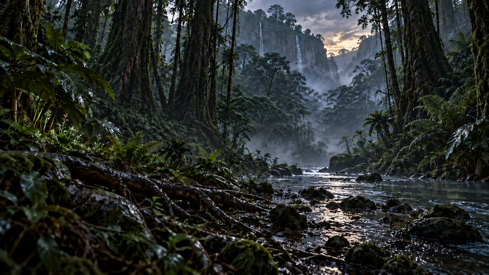
ParaTerra is about a world that feels vast, believable and indifferent. Its identity had to communicate that sensation before the player ever set foot on the terrain.
The world before spectacle
We chose to move away from overtly futuristic signs, luminous effects and metallic artifice. The selected direction is called Terrain: a robust, direct presence, marked by matter but never decorative.
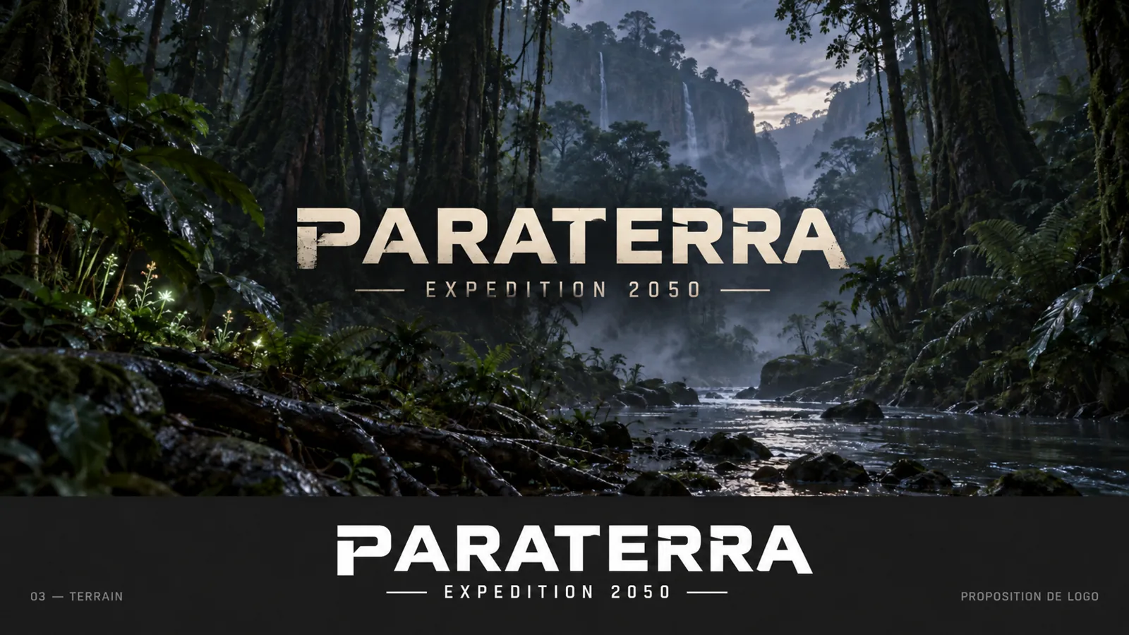
The logo belongs within the landscapes instead of dominating them. Its worn ivory responds to moisture, stone and mist. It reveals nothing about the world; it simply makes you want to enter it.
A typeface born from the logo
The letters P, R, T, E and A established the initial language: bold masses, horizontal cuts, clean counters and tense construction. That vocabulary was then extended across all twenty-six capitals to create Terrain Signature.
The family is completed by Terrain Normal, a more regular and readable face. The former signs the major moments; the latter structures information. Together, they allow the game to retain its voice from the title down to the smallest labels.
The form does not describe danger. It gives weight to the silence before it.
A system, not just a logo
This identity now lives across Steam capsules, icons, the website and future project materials. It relies on a concise palette: abyss, forest, moss, mist and ivory. Motion remains slow and contained, like a reveal through fog.
This first devlog marks a starting point. Future transmissions will explore terrain construction, environmental research and the choices that give ParaTerra’s world its density.

END OF TRANSMISSION / PT-DEV-001
Back to devlogs